I created the UX and UI design for the Account Management and Booking Journey for a travel agency that specialised in resort package holidays.
The Brief
A travel agency catered for package holidays but on their website would only display holidays. Customers needed to telephone to actually place a booking. There was no user account functionality either , so this also needed to be added.
So I was asked to design the user experience for customers to create an online account, and book a package holiday.
The business wanted different ways to search for holiday packages e.g. by location, by holiday type – so this needed to be incorporated into the booking journey too.
Research
I discussed with stakeholders their needs from a business and user perspective, and also conducted research into the account management and booking journeys of other travel companies, such as Expedia, to ensure we also followed where appropriate, an approach that was standard across the industry.
Log-on and My Account
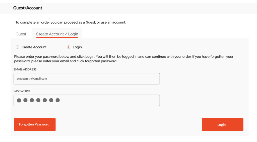
This was standard user log-in and account management, but also the ability to see existing bookings too. I applied my prior business and technical knowledge of user accounts and login with other projects, to define this journey and produced the designs. I mapped out the main process flows for user account creation, login and error handling. I then worked on the wireframes and designs for the account management dashboard. I included any pop-up dialogs, specific tab behaviour, context menu behaviours and alert messages.
Booking
The booking journey could start from different points on the site e.g. by choosing destination first, or choosing holiday type first – so it was important a booking journey remained intuitive and clear. I first mapped out the complete booking journey from each starting point.
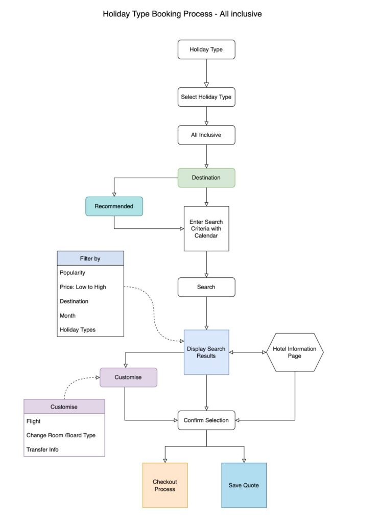
I applied my knowledge of UX Design and my prior experience working on complex booking journeys with EasyJet, to ensure a simple and clear user journey was presented.
Progress Bar
It also needed to be clear where the user was in their booking journey regardless of the user’s starting point. So I implemented a progress bar along the top of the screen, to help the user see where they were in the booking journey.

The user could begin the booking journey through various starting points e.g. by first choosing the holiday destination, or first choosing the holiday type. Each starting point could lead to slightly different follow-on steps that would help narrow down the holidays available, so these steps were designed appropriately for each route too.
Editing from Checkout
Additionally there was a requirement that when the user reached the end of the booking journey prior to Payment, they must be able to view/edit all the flight, location and other holiday details without navigating back from that page. After looking at various options, it was agreed to fulfil this by creating expandable sections on the summary page. See below.
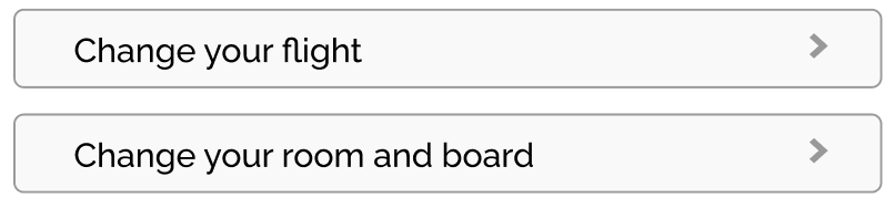
A summary of the booking was also shown at the bottom of this page, because it was deemed important that the the customer has a clear idea of what they were about to purchase.

Designs
I finalised the designs and presented them to the stakeholders for sign off.
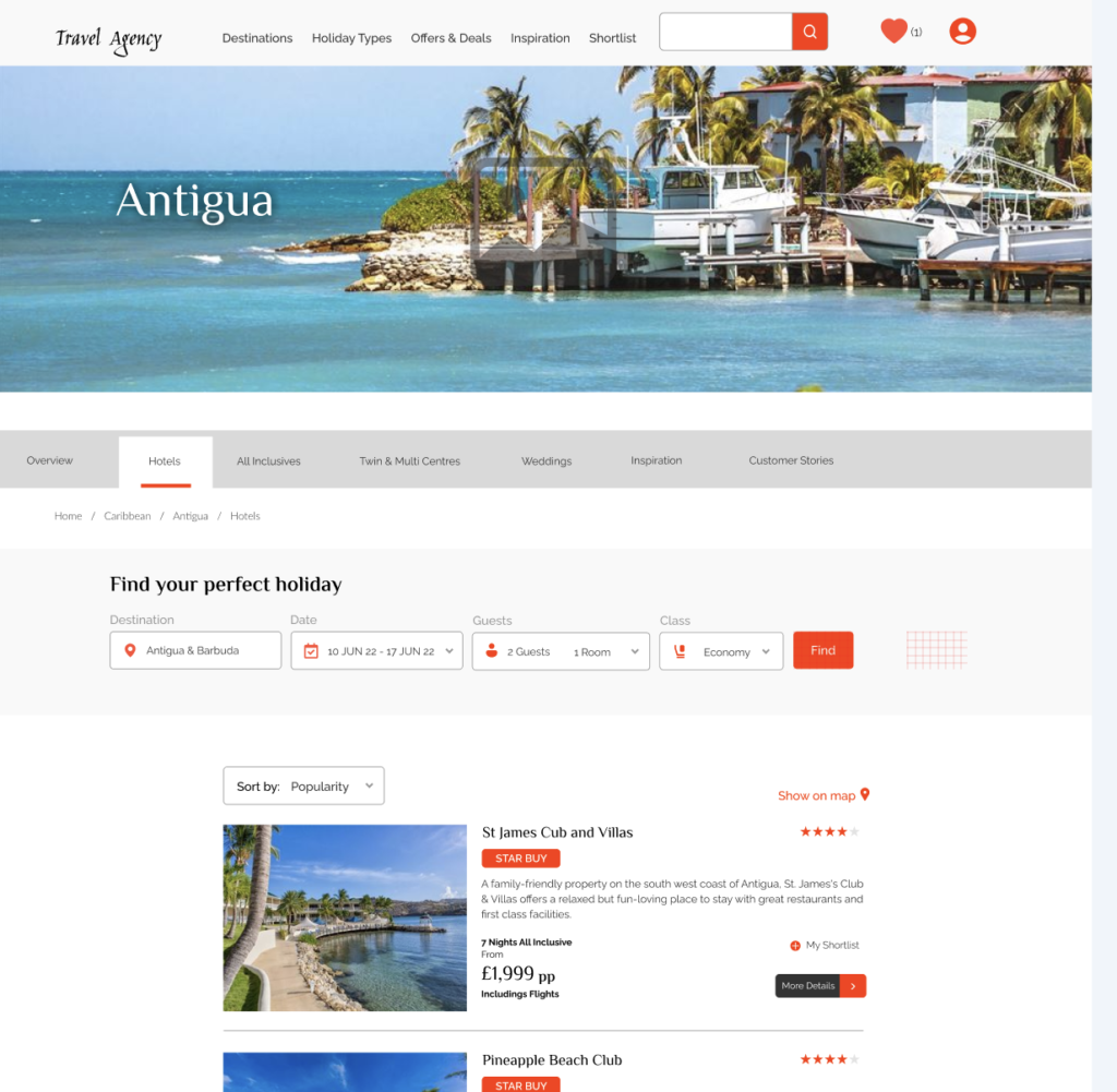
Website Design: Example of website design.
Mobile Design (cut/hide top)
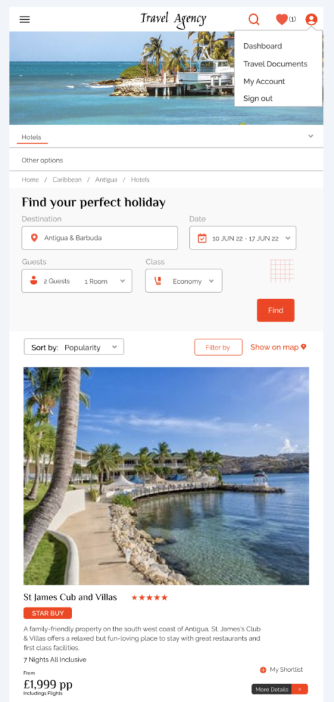
Example of desktop design:
Lessons
Brand Guidelines Clarification
The client initially provided Brand Guidelines including typography and colour scheme, however said they were open to their colours being used a different way to their current approach on their website. However after using the colours in a slightly different way in my the designs, I was then advised by the client that actually they preferred not to change the user of their colours.
This meant I had to back to all the pages and adjust them accordingle. Fortunately, because I had set up a framework in Figma it was not that difficult to change each back to the more standard brand guidelines.
The lesson from this was to ensure that changes to brand guidelines needed to clearly approved prior to working on these.
Stakeholder Decisions Change
Stakeholders sometimes put forward modifications/new functionality to the designs but then once designs were progressing, they would ask that the changes were reversed. Sometimes there may have been technical or cost limitations, but at other times it was perhaps as being now unnecessary.
I realised it was important to initially produce very basic mock ups of any proposals so the client can consider the amended designs easily and feedback quickly, and only complete changes to designs when the proposals had been confirmed.